KRETA AYER HERITAGE GALLERY
USER RESEARCH
UX DESIGN
MOBILE
FIGMA
This project aimed to revitalize the digital presence of the culturally significant Kreta Ayer Heritage Gallery through a user-centered design approach.

THE CHALLENGE
The OClass Ignite app consisted of a dull color palette, overcrowded designs, and a clouded user flow. These factors contributed to major usability issues. Moreover, we needed to design within a strict set of constraints in order to accommodate multiple custom functionalities and limited developer resources.
MY ROLE
As a designer in my team, I led it and corresponded with our client while building out the designs. We conducted multiple rounds of research, produced sketches, wireframes and mockups with iterations before delivering the final assets and documents.
GATHERING INSPIRATION
To gain a deeper understanding of the competitive landscape, we began by thoroughly canvassing the industry, focusing on prominent class booking apps such as Glofox, Momence, Mindbody, and ClassPass. Our primary objective was to analyze these competitors’ offerings to identify trends, strengths, and potential gaps in the market. By examining the features, user interfaces, and overall user experiences of these apps, we sought to gather inspiration and pinpoint areas where we could innovate. This comprehensive analysis enabled us to identify opportunities to differentiate our product, ensuring it would stand out in the crowded class booking app market. Ultimately, our goal was to leverage these insights to create a solution that not only meets but exceeds user expectations, offering a unique and superior experience.
We realised that the OClass Ignite app had the similar design and functions as Glofox. However, certain aspects of the user flow could be improved.
DISCOVER
USER TESTING OF THE ORIGINAL OCLASS IGNITE APP
We started off by seeking out qualitative data to identify early issues in the website that could be corrected within the first couple iterations. Testing was conducted with users who frequent museums but had never interacted with Kreta Ayer Heritage Gallery or its website before.
This round of user testing was moderated. We conducted online testings to examine how users navigated the site to search for the information required.
GATHERING INSPIRATION
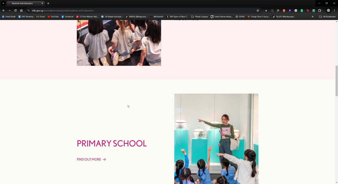
We began canvassing the industry on the websites of renowned local museums, such as the ArtScience Museum, National Gallery of Singapore, and the Peranakan Museum. The goal was to scope out the standards for museum websites, get inspired, and find opportunities for transformation.
We realised that most museum websites have a way of presenting information and exhibits, and the navigation bar provides a clear guide to specific categories and pages.

COMPETITIVE ANALYSIS
In order to assess the strengths and weaknesses of direct competitors in the museum sector, we analyzed three websites dedicated to this industry. The goal was to gain insight into the current offerings, identify areas for enhancement, and uncover any gaps or unmet needs within the sector.
Kreta Ayer Heritage Gallery's website lacked in multiple areas. My team and I had to plan on how to integrate the key information sections into the site.
DEVELOP
WIREFLOW
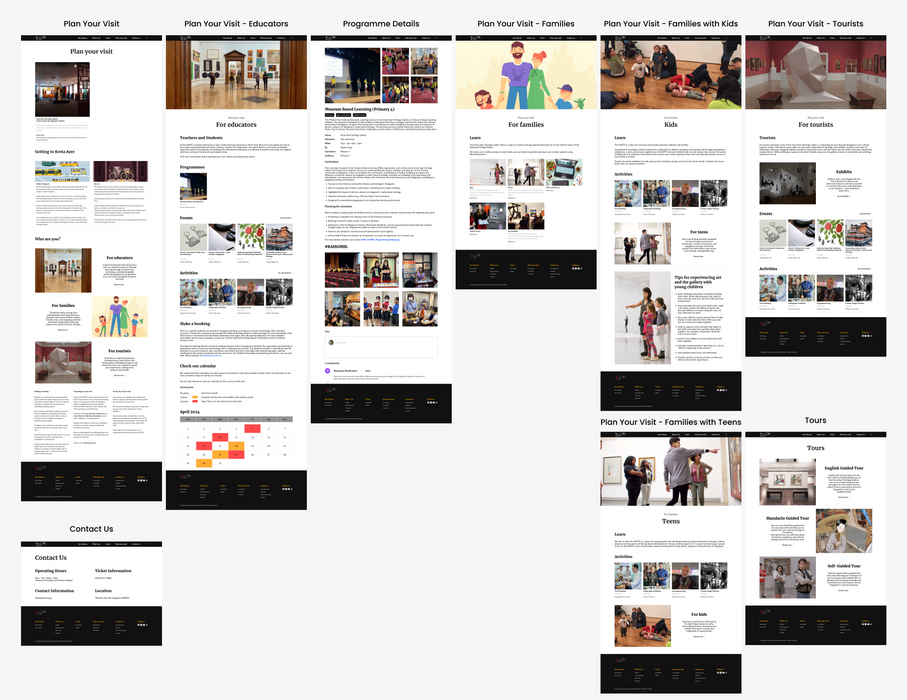
Given that our primary objective was to enhance user flows, we concentrated our efforts on wireframing high-impact screens and key modules where functionality needed to be clearly defined. Instead of wireframing every screen, we prioritized those that would have the most significant effect on user experience.
We then created a detailed wireflow to map out the entire user journey, offering a clear visual representation of how users would interact with the app. This strategic approach allowed us to effectively communicate essential screens and interactions to stakeholders, ensuring alignment across teams while staying on schedule to meet our tight deadline. The wireflow provided a strong foundation for subsequent design phases, ensuring that critical user paths were optimized early in the process.
Low-fidelity wireframes were used to communicate content hierarchy and critical functionalities for development.
WHAT I LEARNED
This was a high-impact project with a challenging deadline, requiring us to maintain a high level of focus and adaptability throughout. While many aspects went smoothly, as with any complex project, there were inevitable setbacks and hurdles to overcome. I make it a point to reflect on both successes and challenges after every project to learn and grow from the experience. One key takeaway from this project was the effectiveness of our small, agile team. Despite the intense pressure and demanding timelines, our team consistently collaborated with precision, communicated openly, and remained resilient. We were able to deliver the product on time without compromising quality, thanks to our agile approach.
The most rewarding aspect of this project was experiencing the agile UX process in action and witnessing its profound impact on both the team and the final product. Our process allowed us to iterate rapidly, involve users consistently for real-time feedback, and adjust our design decisions accordingly. The seamless collaboration minimized stress, encouraged creativity, and resulted in a final product that our client not only valued but also implemented in their current app. Seeing our work come to life and knowing that it contributed meaningfully to the client’s goals was a gratifying conclusion to a demanding but fulfilling project.
MOCKUPS
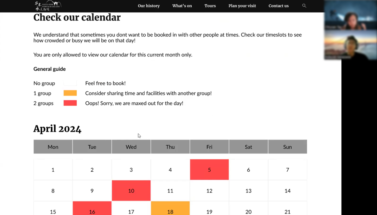
After establishing a clear design direction, we transitioned into producing both high and low-fidelity mockups to bring our concepts to life. These mockups were then transformed into interactive prototypes with limited functionalities, enabling us to conduct iterative rounds of user testing.
This approach allowed test users to interact with a more "polished" version of the design, offering valuable feedback on aesthetics and usability. However, the process also posed challenges, as making revisions to these detailed prototypes required significantly more time compared to rapid prototyping. Despite this, the insights gained from testing with well-developed designs were invaluable in refining the final product and ensuring a high-quality user experience.
High-fidelity mockups and prototypes were great for user testing, as they removed the ambiguity of the design.
CHECK
USER TESTING OF THE PROTOTYPE
Our user testing sessions were conducted on-site, where we closely observed participants as they navigated through the app’s screens. By being physically present, we could capture real-time reactions and subtle user behaviors that might have been missed remotely. Our primary focus was on identifying usability issues, measuring task completion rates, and collecting direct feedback on the overall experience.
This approach allowed us to detect friction points, bottlenecks, and areas where users encountered confusion or frustration. The insights gained from these sessions were instrumental in refining the interface, streamlining the booking and payment flows, and ultimately enhancing both user satisfaction and ease of use. This hands-on testing process ensured that our design decisions were rooted in real user interactions, driving meaningful improvements in the final product.
High-fidelity prototypes were employed for user testing, providing users with a clearer understanding of the app.
EDIT
ITERATIONS
The iteration process for our prototype was a continuous cycle of improvement driven by user feedback, interface refinement, and functionality enhancements. After each round of user testing, we meticulously analyzed the insights gathered to identify pain points and areas for enhancement. We then updated the design, incorporating these learnings to make the app more intuitive, user-friendly, and efficient.
This revised prototype was put through another round of testing to validate the changes and gather further feedback. Repeating this cycle allowed us to progressively optimize the app’s design and functionality, ensuring that each iteration brought us closer to delivering an exceptional user experience that aligns with both user needs and project goals.
Iterations were done based on user feedback to refine designs, enhance usability and overall user experience.
NEW LAYOUT PROPOSAL


KRETA AYER HERITAGE GALLERY
USER RESEARCH
UX DESIGN
MOBILE
FIGMA
This project aimed to revitalize the digital presence of the culturally significant Kreta Ayer Heritage Gallery through a user-centered design approach.

THE CHALLENGE
The Kreta Ayer Heritage Gallery's website makes it difficult for users to understand the company's offerings. Its lack of clarity hinders user engagement, which results in low retention.
View the live website here.
MY ROLE
As a UX Designer in my team, I conducted extensive research and corresponded with teammates while building out the designs. We produced sketches, wireframes and mockups with iterations before delivering the final assets and documents.
DISCOVER
USER TESTING OF THE ORIGINAL WEBSITE
We started off by seeking out qualitative data to identify early issues in the website that could be corrected within the first couple iterations. Testing was conducted with users who frequent museums but had never interacted with Kreta Ayer Heritage Gallery or its website before.
This round of user testing was moderated, and done online to see how users navigated the site to seek the information required.
GATHERING INSPIRATION
We began canvassing the industry on the websites of renowned local museums, such as the ArtScience Museum, National Gallery of Singapore, and the Peranakan Museum. The goal was to scope out the standards for museum websites, get inspired, and find opportunities for transformation.
We realised that most museum websites have a way of presenting information and exhibits, and the navigation bar provides a clear guide to specific categories and pages.
COMPETITIVE ANALYSIS
In order to assess the strengths and weaknesses of direct competitors in the museum sector, we analyzed three websites dedicated to this industry. The goal was to gain insight into the current offerings, identify areas for enhancement, and uncover any gaps or unmet needs within the sector.
Kreta Ayer Heritage Gallery's website lacked in multiple areas. My team and I had to plan on how to integrate the key information sections into the site.
DEVELOP
WIREFLOW
Given that our client’s primary objective was to enhance user flows, we concentrated our efforts on wireframing high-impact screens and key modules where functionality needed to be clearly defined. Instead of wireframing every screen, we prioritized those that would have the most significant effect on user experience. We then created a detailed wireflow to map out the entire user journey, offering a clear visual representation of how users would interact with the app. This strategic approach allowed us to effectively communicate essential screens and interactions to stakeholders, ensuring alignment across teams while staying on schedule to meet our tight deadline. The wireflow provided a strong foundation for subsequent design phases, ensuring that critical user paths were optimized early in the process.
Low-fidelity wireframes were used to communicate content hierarchy and critical functionalities for development.
MOCKUPS
After establishing a clear design direction, we transitioned into producing both high and low-fidelity mockups to bring our concepts to life. These mockups were then transformed into interactive prototypes with limited functionalities, enabling us to conduct iterative rounds of user testing. This approach allowed test users to interact with a more "polished" version of the design, offering valuable feedback on aesthetics and usability. However, the process also posed challenges, as making revisions to these detailed prototypes required significantly more time compared to rapid prototyping. Despite this, the insights gained from testing with well-developed designs were invaluable in refining the final product and ensuring a high-quality user experience.
High-fidelity mockups and prototypes were great for user testing, as they removed the ambiguity of the design.
CHECK
USER TESTING OF THE PROTOTYPE
Our user testing sessions were conducted on-site, where we closely observed participants as they navigated through the app’s screens. By being physically present, we could capture real-time reactions and subtle user behaviors that might have been missed remotely. Our primary focus was on identifying usability issues, measuring task completion rates, and collecting direct feedback on the overall experience. This approach allowed us to detect friction points, bottlenecks, and areas where users encountered confusion or frustration. The insights gained from these sessions were instrumental in refining the interface, streamlining the booking and payment flows, and ultimately enhancing both user satisfaction and ease of use. This hands-on testing process ensured that our design decisions were rooted in real user interactions, driving meaningful improvements in the final product.
High-fidelity prototypes were employed for user testing, providing users with a clearer understanding of the app.
EDIT
ITERATIONS
The iteration process for our prototype was a continuous cycle of improvement driven by user feedback, interface refinement, and functionality enhancements. After each round of user testing, we meticulously analyzed the insights gathered to identify pain points and areas for enhancement. We then updated the design, incorporating these learnings to make the app more intuitive, user-friendly, and efficient. This revised prototype was put through another round of testing to validate the changes and gather further feedback. Repeating this cycle allowed us to progressively optimize the app’s design and functionality, ensuring that each iteration brought us closer to delivering an exceptional user experience that aligns with both user needs and project goals.
Iterations were done based on user feedback to refine designs, enhance usability and overall user experience.


